Internal Reference
Style Guide
v1.0 - 2026-06-03
Logo & Brand Mark
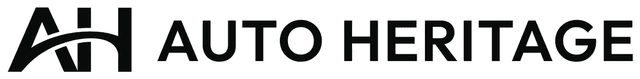
Horizontal - Light BG

Horizontal - Dark BG
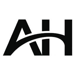
Brand Mark - Light BG
Brand Mark - Dark BG
Wordmark Only
48px
32px
16px
Favicon - Brandmark at sizes
Usage Rules
- Favicon uses the brandmark only (AH wireframe monogram), black on white
- Minimum clear space around logo: equal to the height of the "A" crossbar
- Never rotate, stretch, or add effects to the logo
- On dark backgrounds, use the inverted (white) version - never place dark logo on dark bg
Color Palette
Background
#f2f2f2
--color-bg
Card / Surface
#ffffff
--color-card
Text / Primary
#141414
--color-text
Muted / Secondary
#737373
--color-muted
Border / Divider
#e2e2e2
--color-border
Hover / Subtle
#fdfdfd
--color-hover
Opacity Variants
white/70
white/60
white/50
white/40
white/10
Used on dark footer for text hierarchy. Never use colored accents.
Typography
Primary - Outfit (Light 300)
Display Heading
52px / font-light / tracking-[-1px] / leading-[56px]
Section Heading
32px / font-light / tracking-[0.5px] / leading-[36px]
Card Heading
28px / font-light / tracking-[0.5px] / leading-[34px]
Subsection Title
20px / font-light / tracking-[0.5px] / leading-[26px]
Body text uses Outfit at weight 300 with generous line-height for readability. The thin, geometric aesthetic matches the wireframe monogram logo - precision without heaviness.
15px / font-light (inherited) / leading-[26px]
Secondary text for descriptions, card content, and supporting information. Uses muted color.
14px / text-[var(--color-muted)] / leading-[22px]
Small body text for metadata, timestamps, and tertiary content.
13px / text-[var(--color-muted)] / leading-[20px]
Labels & Eyebrows - Outfit (Uppercase)
Eyebrow - Wide
11px / font-light / uppercase / tracking-[4px]
Section Label - Medium
11px / font-light / uppercase / tracking-[3px]
Card Label - Compact
11px / font-medium / uppercase / tracking-[2px]
Footer Label
11px / font-light / uppercase / tracking-[1.5px]
Monospace - Geist Mono (Data & Stats)
142 Vehicles
20px / Geist Mono / font-medium - stats & hero numbers
3.0L V6 Twin-Turbo - 450 hp @ 6,500 rpm
13px / Geist Mono - specs & technical data
v1.0 - 2026-03-19
11px / Geist Mono - version numbers, dates, meta
Buttons
Primary Actions
rounded-[4px] / px-6 py-2.5 / 14px / font-light / tracking-[0.5px]
Small Actions
rounded-[4px] / px-3 py-1.5 / 12px / font-light / tracking-[0.5px]
Filter Pills
rounded-[4px] / px-4 py-2 / 13px / font-light / tracking-[0.5px]
Full Width - Forms
w-full / rounded-[4px] / py-3 / 14px / font-light / tracking-[0.5px]
Disabled States
disabled:opacity-40 / cursor not-allowed
Cards
Label
Card Title
Description text with supporting information.
Label
Card Title
Description text with supporting information.
Label
Card Title
Description text with supporting information.
rounded-[4px] / border / hover:border-[var(--color-muted)] / no shadows
Form Inputs
rounded-[4px] / border / bg-[var(--color-bg)] / focus:border-muted
Navigation
Header Navigation
rounded-[4px] / h-[36px] / 14px / font-light / tracking-[0.5px] / hover:bg-[var(--color-bg)]
Footer Navigation
Browse
ArchiveCollectionsBrandsErasJournalBookmarksCollections
V12 LegendsInline-Six HeritageTurbo EraDesign IconsOpen-Top HeritageAuto Heritage
AboutContactPrivacy PolicyTerms of UseCookie PolicyStyle GuideSection headers: 11px / font-light / uppercase / tracking-[3px] / white/40. Links: 14px / white/70 / hover:white
Breadcrumbs
13px / separator: "/" in border color / current: text color / parents: muted
Icons
Stroke Icons - Lucide Style
Search
Bookmark
Menu
Close
Arrow
Chevron
External
Share
fill="none" / stroke="currentColor" / strokeWidth=2 / strokeLinecap="round" / strokeLinejoin="round"
Never use filled icons. Circular icon buttons (close, back) may use rounded-full.
Dividers & Borders
Hairline
h-px / bg-[var(--color-border)]
Card Border
border border-[var(--color-border)] / rounded-[4px]
Ring (Overlays)
ring-1 ring-[var(--color-border)]
Dark Divider (Footer)
border-white/10 - footer & dark sections
Transitions & Hover States
Button Hover
Primary: hover:opacity-80. Secondary: hover:bg-[var(--color-bg)]. Ghost: hover:text-[var(--color-text)].
Card Hover
hover:border-[var(--color-muted)]. No shadow transitions.
Link Hover
transition-colors / hover:text-white (dark bg) or hover:text-[var(--color-text)] (light bg).
Image Hover
transition-transform duration-700 / group-hover:scale-[1.06].
Transition Speed
duration-300 for colors. duration-500 for transforms. duration-700 for images.
Easing
Default ease. No bounce, spring, or elastic effects.
Spacing & Layout Rules
Border Radius
4px everywhere. No rounded corners on containers. rounded-full only on small icon buttons.
Shadows
None. Use 1px borders instead. Hover: border-[var(--color-muted)].
Page Padding
px-8 (mobile: px-5). Max-width containers: 1200px.
Section Spacing
py-14 to py-16 between major sections. mb-20 in style guide.
Card Padding
p-6 for standard cards. p-8 for large/featured. Internal gaps: gap-3 to gap-4.
Font Weight
300 (light) body default. 200 for display. 500 (medium) only for small labels at 11px.
Letter Spacing
Headings: -1px to 0.5px. Labels: 2px-4px uppercase. Buttons: 0.5px. Body: 0.01em.
Line Height
1.7 global. Headings: tight (56px/34px). Body: 24-26px.
Icon Style
Stroke only (Lucide). strokeWidth=2, linecap/linejoin=round. Never filled.
Images
object-contain, no border-radius. Hover: duration-700 scale-[1.06].
Header Height
68px fixed. Sticky top-0 z-50.
Footer
Dark bg (--color-text). rounded-[4px]. Logo + newsletter top, 3-col links, copyright bar bottom.
This page is not indexed by search engines. For internal reference only.